

Every so often a chart crosses our desks that we didn't design—but wish we'd been asked to. This one came from Hong Kong's own Legislative Council Secretariat: a chart showing how the government's tax revenue breaks down, year by year.
It's a chart with a good instinct behind it: show the overall size of government revenue, and show how the mix of income sources has shifted over time. But the way it tries to do both at once creates most of the problems below. We'll walk through what makes it hard to read, then rebuild it our way.
01 Two datasets, one chart, one pair of axes
The original chart tries to show two different kinds of numbers at once: grey bars for the government's actual revenue in HK$ billions, and coloured lines for each tax category's share of that revenue, as a percentage. One is a real quantity; the other is a proportion. Because they can't sit on the same scale, the chart borrows the classic (and classically criticised) dual‑axis combo: bars against one invisible axis, lines against another.
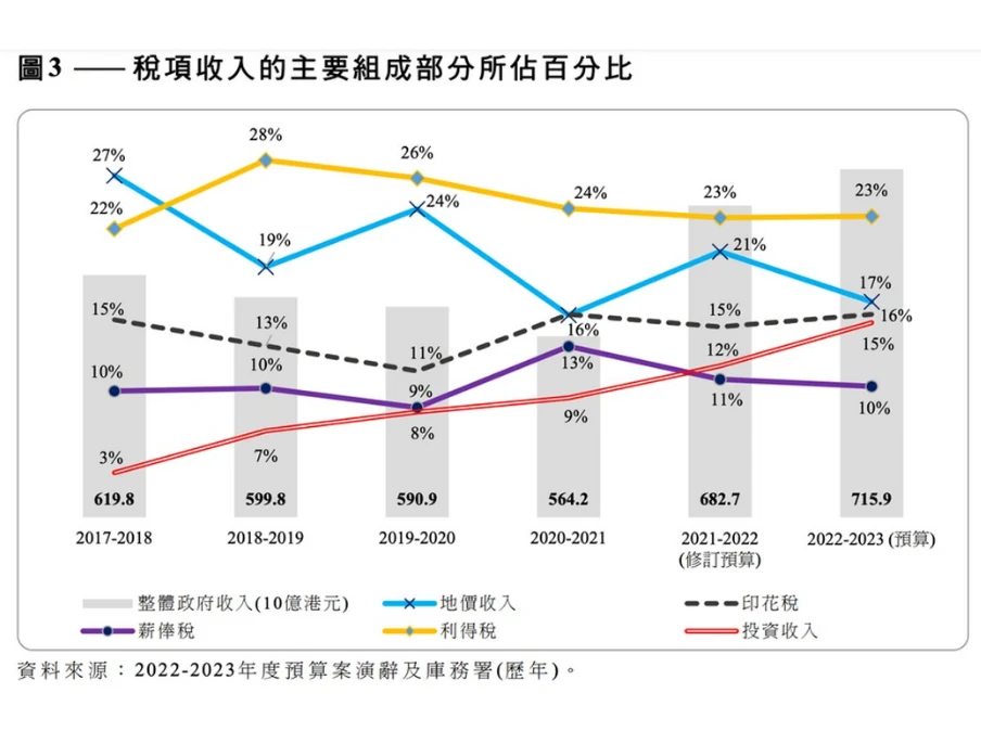
Dual-axis charts aren't automatically wrong—they're useful when you genuinely want to show how two measures move together. The trouble here is that they largely don't. Investment income's share climbs steadily; land premium's share falls; total revenue itself dips and then recovers. Overlaying all of it doesn't reveal a relationship, it just asks the reader to hold four unrelated stories in their head simultaneously.
02 No axis, no ticks, no scale
Neither the bar axis nor the line axis in the original chart shows a scale. There's no y-axis, no gridlines, no tick marks—just the bars and lines floating against the data labels printed on top of them. That forces the reader to read every single number off the chart instead of getting a feel for the shape of the trend at a glance, which somewhat defeats the purpose of charting the data in the first place.
03 A hidden baseline exaggerates the swings
Because there's no visible axis, there's also no way to tell whether the bars start at zero. They don't. That single choice makes government revenue look like it swings wildly from year to year. Look at the actual numbers, though: revenue ranged from about HK$564 billion to HK$716 billion across the period shown—a change of roughly 21%. Stamp duty's share of revenue, by contrast, moved from 11% to 16%—a smaller-looking 5 percentage points on the page, but a larger relative swing of about 45%. The chart's visual emphasis and the data's actual emphasis point in opposite directions.
04 A legend stranded far from the data
The legend sits below the whole chart, so every time a reader wants to know which line is which, their eyes have to leave the data, scan down to the legend, and travel back up again—repeated for every one of the four line series. It's a small tax on attention that adds up over the length of the chart.
05 Colour was already enough
On top of colour, the original chart also assigns each line its own marker shape and stroke style: a cross for one, a solid dot for another, a diamond for a third, a dashed stroke for a fourth. It reads like every formatting option in the charting tool got switched on. Colour alone was already sufficient to tell the four categories apart—the extra encodings add visual noise without adding information.
06 The fix: pick one number, then label it directly
If you have the freedom to redesign this from scratch, the cleanest option is two separate charts: one for total revenue, one for the share breakdown. But if you're expected to keep it as a single chart—because that's the brief, or because "two simple charts" doesn't feel finished to whoever's reviewing it—here's how we'd approach it.
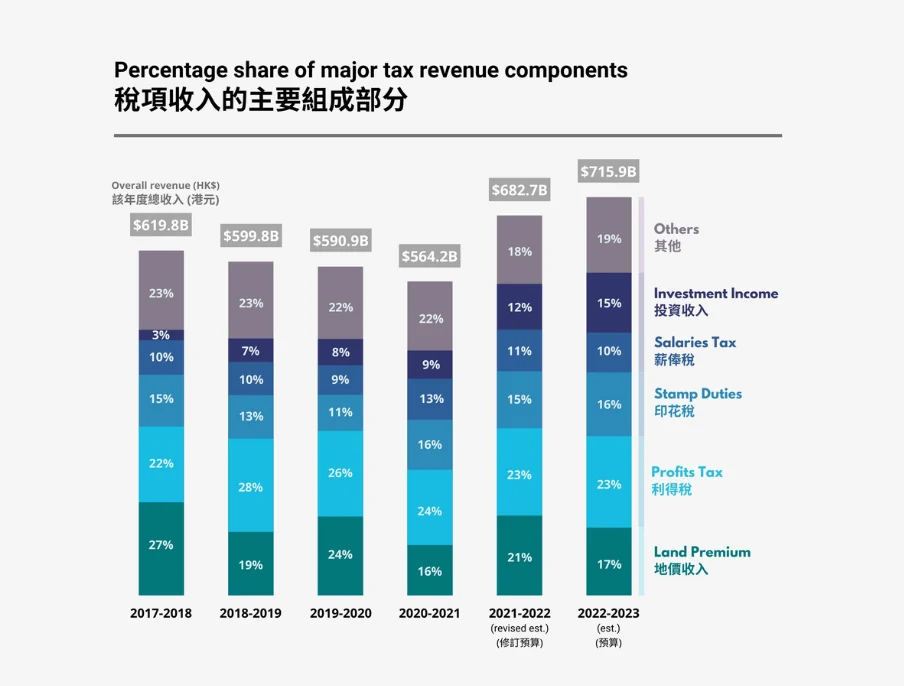
First, only one of the two datasets can be the chart's main subject. We chose the actual figures over the percentages, since absolute revenue is usually the more consequential number for a budget conversation. Second, instead of separate lines fighting for the same space as the bars, we combined both datasets into a single stacked bar chart—each bar is the total revenue, and its segments are the categories that make it up. Third, we dropped the legend entirely and labelled each segment directly, so there's nothing to look up.
07 Even the upgraded version has a catch
If you want to go a step further and still show the year-on-year trend in each category's share—which the original line chart did have going for it—you can pair the stacked bar chart with a stacked area chart built from the same categories, so the two visuals tell a consistent story side by side.
But this comes with its own trap worth naming: in a stacked area chart, only the bottom-most band has a slope you can read literally. Every band above it is riding on the bands beneath, so its apparent slope is a mix of its own change and the change in everything underneath it. Investment income's share climbing from 9% to 12% between two years can look like a steep, dramatic slope purely because of what's stacked below it, not because the actual change was that large. We used it here because the chart's main job is still to show total revenue and the broad shape of the mix—not to support precise slope-reading on every category—but it's a trade-off, not a free upgrade.
More from the studio



Send it our way
Rough draft, messy spreadsheet, or a chart you inherited and don't quite trust—we're glad to take a look.
Get in touch